Creating a calm and peaceful atmosphere at home starts with the colors you choose for your walls and décor. Colors have a powerful impact on mood and can either energize or soothe us. If you’re aiming to design a restful space where you can unwind and recharge, selecting calm, gentle colors is a great place to start.
In this post, we’ll explore practical tips for choosing calm colors for your home. Whether you’re repainting a room or just considering new accents, these ideas can help you create an inviting and tranquil environment.
Why Choose Calm Colors?
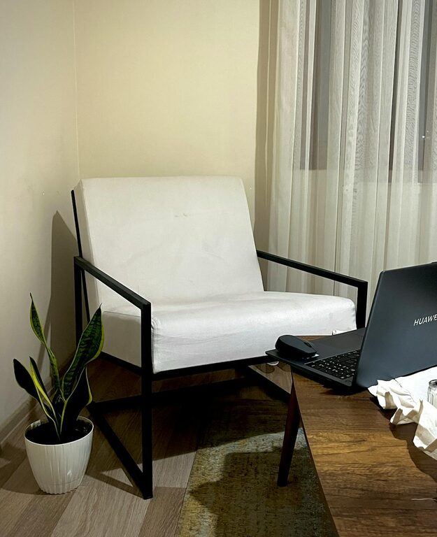
Calm colors typically refer to soft, muted hues that evoke feelings of relaxation and balance. Unlike bright or highly saturated colors that stimulate energy and activity, calm shades help reduce stress and create a sense of harmony.
Common calm color families include:
– Soft blues
– Pale greens
– Warm neutrals
– Light lavenders
– Gentle greys
These colors tend to work well in rooms where peace and relaxation are key, such as bedrooms, living rooms, or reading nooks.
Tips for Selecting Calm Colors
1. Understand the Mood You Want to Create
Before choosing colors, think about the mood you want your space to convey. Do you want a serene bedroom that promotes restful sleep? Or perhaps a gentle living room where you can relax after work? Knowing the atmosphere you’re aiming for will guide your choices.
For example:
– Blues and greens promote calmness and tranquility.
– Warm neutrals like beige or soft taupe feel cozy and comforting.
– Light lavenders can add a subtle touch of elegance while keeping things soothing.
2. Consider the Lighting in Your Space
Lighting greatly affects how colors look and feel. Natural light tends to soften colors, while artificial light can change the shade subtly. It’s important to test paint samples in the actual room under different lighting conditions—morning, afternoon, and evening—to see how the colors appear throughout the day.
3. Use Paint Samples and Test Swatches
Don’t just rely on paint chips or photos you see online. Get small paint sample pots and apply patches on your walls. Live with the colors on your walls for a few days to understand how they change with light and influence your mood.
4. Opt for Muted or Pastel Shades
Highly bright or bold colors are usually energizing rather than calming. When aiming for tranquility, seek out pastel or muted tones — these have lower saturation and soften the environment. For example, dusty blue, sage green, or pale blush pink are excellent calm choices.
5. Coordinate with Your Existing Decor
Look at the color palette of your furniture, flooring, and accessories. Choose wall colors that complement these existing elements to maintain a cohesive, soothing look. Neutral bases with soft accents work well to keep things balanced.
6. Think About Color Psychology
Colors influence emotions sometimes subtly, other times strongly. Here are some calm color recommendations based on color psychology:
– Blue: Often linked with peace and calm, blue slows the heart rate and induces relaxation.
– Green: Connected to nature, green is refreshing and restful to the eyes.
– Lavender: This muted purple shade promotes tranquility and softness.
– Gray: A neutral gray can be very calming when balanced with warm accents.
– Beige and Cream: These earthy neutrals create a warm, inviting space without overstimulation.
7. Incorporate Different Shades and Textures
Using a single color on all walls can feel flat. Instead, try layering different shades of your calm color to add depth—like a soft blue on the walls paired with a pale blue-gray accent wall.
In addition, textures add comfort and interest without disrupting calmness. Think woven rugs, soft curtains, or smooth wood finishes in calm-toned rooms.
8. Avoid Overly Dark or Cold Tones Unless Balanced
Dark colors can sometimes feel heavy or oppressive. If you love deep blue or charcoal gray, balance them with lighter elements like white trim or soft furnishings to keep the space from feeling gloomy.
Similarly, icy or overly cool tones without warmth may seem cold or sterile. Balancing these with wood textures or warm metals like brass can help maintain a relaxing environment.
Popular Calm Color Combinations for Your Home
Here are some tried-and-true calm palettes to inspire your next painting project:
– Soft Blue + White + Light Wood: Classic and airy, perfect for bedrooms or living rooms.
– Sage Green + Cream + Natural Linen: Earthy and serene, great for a cozy reading nook.
– Light Gray + Blush Pink + Warm Taupe: Soft and sophisticated for a stylish calm space.
– Lavender + Pale Blue + White: A gentle mix for bedrooms or bathrooms.
– Beige + Olive Green + Soft Gold Accents: Warm and inviting, excellent in living areas.
Final Thoughts
Choosing calm colors for your home is more than just picking pretty shades—it’s about crafting spaces where you feel comfortable, peaceful, and happy. Taking time to understand how colors impact mood and integrating these tones thoughtfully can transform your environment into a true sanctuary.
Remember to test samples, consider your lighting, and coordinate with your décor to create a harmonious look. With these tips, you’ll enjoy your calm-colored home for many stress-free days to come. Happy decorating!